Ecommerce design for a brand, not a marketplace
A brand shop is an edited room with a point of view, not an infinite marketplace grid. Price, trust, and the path to pay still have to be obvious.
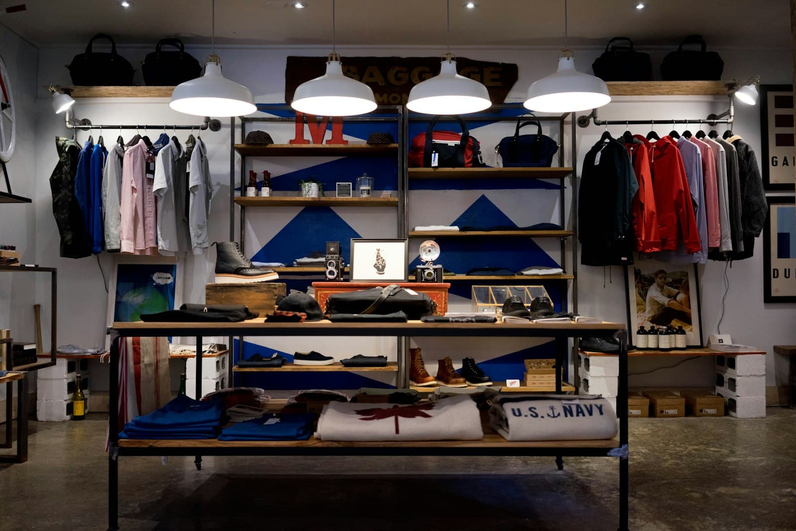
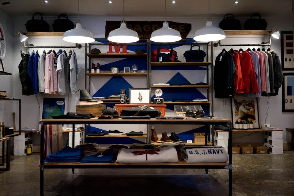
Ecommerce website design for brands is the design of a room, edited on purpose. A stranger should be able to tell what you make, why it exists, and how to buy one thing, without walking an infinite aisle of adjacent products.
A marketplace can afford to look like a warehouse. A brand cannot. The shop is part of the product. If the first screen could belong to any store in the category, the brand has not reached the shelf.
Edit the room
Start by choosing what is allowed on the first view. A few products, a short line about the maker, and one path to a collection you are proud of. Everything else can wait one click away. The click is not a failure. An unscrolled grid of the entire catalog is the failure, because nothing in it is a point of view.
Editing is a commercial decision. You are saying which object represents you this season. If you cannot choose, the shop will choose at random, usually by whatever was uploaded last. That is how a careful brand starts to look like a feed.
Down the Cove is a public example of this kind of work: an ecommerce restructure, migration, and redesign, so the shop could be maintained as a coherent place rather than a pile of pages. Wabisabi is a different reference, a calm brand site. Neither is a sales figure. One shows a store that had to be rebuilt with a point of view. The other shows how quiet a visual world can be when the brand refuses noise. Use them as kinds of rooms, not as benchmarks.
Give the room a sequence. People enter, understand, look closer, and buy. A brand shop can follow that sequence on purpose. A marketplace follows a search box, because the shopper arrived already hunting a commodity. If your customer does not yet know the object, a search box as the whole first screen asks them to do the merchandising.
Write down what you will not show above the fold. A popup, a row of payment logos, a blog, and a grid of forty thumbnails can all be true and still be wrong for the entrance. Truth can move lower on the page. The entrance has a job.
Say what you sell before they scroll

Nielsen Norman Group's 2011 study of how long people stay on web pages found that users often leave within 10–20 seconds, and that a clear value proposition has to land within about 10 seconds if you want a longer visit. A brand shop spends that budget on the object and the sentence, not on a manifesto.
The sentence should name the goods in human language. "Small-batch ceramics for everyday tables" can be judged. "Objects for intentional living" cannot. The second line can add who it is for, or what you refuse, such as no seasonal landfill of novelty mugs. Refusal is often clearer than a list of adjectives.
Show price where the object appears, at least as a range if the pieces vary. A brand that hides the number until the product page is asking for a second visit it may not get. People who cannot afford the work will leave either way. People who can will trust you sooner if the number is part of the introduction.
Navigation should sound like the collection, not like a template. "Shop," "About," and "Journal" are fine if they are true. A row of categories copied from a department store, with one product in each, makes a small catalog look unfinished. Fewer links, each with enough work behind it, read as confidence.
Photography and type do the merchandising
In a brand shop the picture is the shelf talker. Consistent crop, a background you chose, and a subject that is the object, not a lifestyle scene where the object is a speck. Mixed crops, some floating on white and some buried in a dark room, make the grid look like several stores sharing a URL.
Direct the pictures the way you direct the copy. What is in frame. What is cut off. What you will not photograph, such as a fake hand you do not have a release for, or a prop that dates the product. Wabisabi's calm is this kind of decision carried through a site: the visual world stays quiet enough that the work can be seen. You can aim at that discipline without pretending to copy another brand's surface.
Type should be readable over the photograph and quiet enough to let the object lead. A display face on every product name turns the grid into a poster competition. One type family, a size for the name, a size for the price, and a rule for what happens on a long name. Long names will happen. Plan the wrap before launch week.
Color belongs to the brand, not to each new campaign. A sale can be announced without repainting the shop. If every promotion invents a palette, regulars lose the room they trusted.
The room still has to be fast

Heavy pictures are part of a brand shop, and they are also the usual reason the first view is late. Google's Core Web Vitals targets are the practical bar: largest contentful paint within 2.5 seconds, interaction to next paint within 200 milliseconds, and cumulative layout shift under 0.1. A beautiful room that arrives late, or that jumps while the prices load, feels careless. Carelessness is not a brand attribute you want.
Treat the first image as a designed asset, not as the original camera file. Crop to the frame you will actually show. Give the page its dimensions so type does not leap when the file arrives. The same restraint you applied to the edit of the catalog applies to the weight of the page. Fewer images above the fold is a speed decision and a taste decision at the same time.
Motion should be rare. A slow zoom on every product tile fights the person who is trying to compare two pieces. If you move something, move it to show a second view of the object, and respect people who have asked the system for reduced motion. A still image is a complete answer.
Hanabi builds this kind of shop as a real front end, not as a theme with the logo swapped. The stack on the studio's own product work is the same idea of ownership: a site the team can change, in a codebase they keep. The shop should be editable where the catalog changes, and stable where the brand should not drift.
What to postpone
Postpone the features that make a small catalog impersonate a mall. Reviews you do not have yet, a recommendation engine with nothing to recommend, a loyalty program before you have repeat buyers, and a filter for attributes only one product uses. Each of those adds chrome and asks the founder to feed a system.
Postpone a second currency, a second language, and a wholesale portal until the retail room is clear. They are real projects. They are not decorations for launch week.
Keep the journal, if you have one, in a role that serves the shop. A story about how a glaze is mixed can sit with the collection it explains. A blog that never mentions the objects is a second site living in the navigation.
When the room is edited, the product page can do its narrower job. Product pages that explain the thing, then step aside is the next piece: object, price, and the one reason it exists, with the essay after the decision is possible.
The public examples of this range sit with Hanabi's selected work. Look for whether the shop has a point of view, not for a claim about revenue.
Frequently asked questions
How is a brand shop different from a marketplace?
A brand shop is an edited room. The first view shows a few products, a sentence about what you make, and one path into a collection. A marketplace can open on search, because the shopper often arrived already hunting a commodity.
What should the first screen of a brand shop say?
Name the goods in language a stranger can judge, and show a price or an honest range. People often decide whether to stay in the first 10–20 seconds, so a manifesto can sit lower. The entrance's job is to say what this shop is.
What should a small catalog postpone?
Postpone reviews you do not have, a recommendation engine with nothing to recommend, and a filter for an attribute only one product uses. A second currency or a wholesale portal can wait until the retail room is clear. Fewer links, each with real work behind it, read as confidence.
Sources and further reading
- How Long Do Users Stay on Web Pages?, Nielsen Norman Group
- Core Web Vitals, Google Search Central
Written by
Hanabi
Hanabi is a product design and web development studio. The studio writes about clear websites, brand systems, and product interfaces for founders.