The pages a seed-stage site actually needs
A seed-stage site needs home, a product or service page, proof, a short about page, and a way to start a conversation. Postpone blogs, jobs, and press until someone needs them.
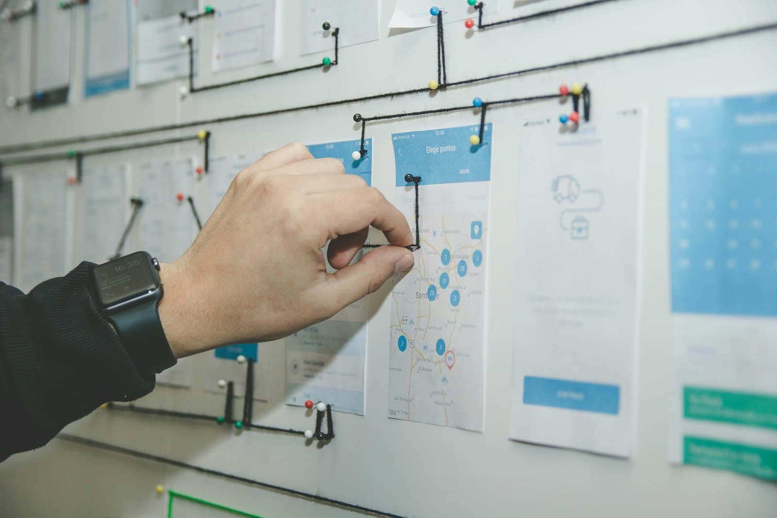
A startup website structure for a seed-stage company can stay small. You need a home page, a page for the product or the service, a place for proof, a short about page, and a way to start a conversation. Add other URLs when a real visit needs them. Until then, extra pages make the company look broader than it is, and they give you more writing than you can keep true.
Each of those pages should be able to stand alone. Google's guidance on title links asks for a descriptive title on every page, and it warns against vague labels such as "Home" and against repeating the same boilerplate on every URL. A person should be able to tell two of your pages apart from the titles alone. Google's people-first questions also ask whether a visitor can tell who is behind the work. That is the job of the about page, not a trick. It is a reasonable thing to answer before you ask for a meeting.
Home
The home page has one job. Say what this is, who it is for, and how to talk to a person. A brand line can sit above that sentence. The sentence still has to be specific.
Do not try to summarize every future page in the hero. Link to the product, the proof, and the about page in the navigation, and let those pages do their own explaining. The home page can preview each in a few lines. Previews are not substitutes. If the only description of the product lives in a card on the homepage, you do not yet have a product page.
Keep the primary action on the home page. If the action is an intro call, the button can go to a calendar or to a short contact page. Either is fine. Hiding the action inside the about page makes the site feel shy about the business.
Product or service

Give the offer its own URL. Buyers who are already interested should land somewhere that explains the thing without the brand film in front of it.
Say what the buyer gets, how it works in a few steps, what is included, and what is not. If you sell a service, describe the engagement in the order it happens: a conversation, a scope, design, build, launch, and the handoff. If you sell software, describe the job the product does this month, not the platform it might become.
This page is where detail belongs. Comparisons, constraints, and the questions you answer on every call. Write them as answers, not as teasers. A seed-stage buyer is deciding whether you understand the problem. A page that withholds the explanation to "get them on a call" reads as thin.
If you have two offers that different people buy, give them two pages when both are real. If one of them is a side thought, leave it off the site. A navigation full of half-built offers is a structure problem, not a design problem.
Proof
Proof is a page or a section that shows the work, the product, or the result in a form a stranger can inspect. Screenshots with no decision behind them are decoration. A useful proof page names the situation and what you chose to do.
At seed stage, a handful of true examples beats a case-study machine. One project, told plainly, is enough to start. Hanabi's public work is a model of the level of claim that is safe: Down the Cove as an ecommerce restructure and redesign, Thomas Bewick as an editorial site for a heritage craft, Ballarat Box Sports as a community sports site, Wabisabi as a calm brand site, Got Next and Leadly as product interfaces. The pattern is the kind of work, not an invented outcome.
If you cannot show client work, show the product. A short walkthrough of the interface, with the empty state and the finished state, is proof that the thing exists. Skip metrics you do not have. A quiet page is more credible than a precise-sounding fiction.
Put proof where a skeptical person can find it from the home page in one click. Do not bury it under a press page you will not maintain.
About, and a way to start

The about page answers who will do the work and how to think about the practice. Keep it short. What you make. Who it is for. How you work. How to reach you. A seed-stage about page does not need a timeline back to a university, a values grid, or a stock photo of a handshake.
This is the page that makes authorship visible. A visitor who is about to share their plans should be able to see a name, a place to reply, and a description that matches the work. Google's people-first notes treat that clarity as part of trust. You do not need a long biography to provide it.
The way to start a conversation can be the about page, a contact page, or a calendar link that appears on every page. Pick one path and use it everywhere. The label should say what the person gets: an intro call, a reply by email, a sample. Make sure the message reaches an inbox a human reads. A structure diagram that ends in an unattended form is unfinished.
Name the person who receives it, at least internally. The site does not have to publish a private mobile number. It does have to connect to someone who can say yes, no, or not yet.
What to postpone
Postpone anything that does not serve a visit you are already getting.
- A blog, until you can keep a few answers up to date. An abandoned journal makes the company look stalled.
- A careers page, until you are hiring. "No open roles" is an honest line on the about page. A full jobs section with no jobs looks like a costume.
- A press room, until someone asks for a logo and a sentence.
- A second language, until a second audience is real.
- Docs, until users need them. Early documentation that restates the marketing page helps no one.
- A pricing page full of tiers you will renegotiate on the call. A sentence about how pricing works is enough.
Also postpone accounts, portals, and customer logins on the marketing site unless those users are part of this launch. Mixing a sales story and a signed-in product on one homepage confuses both groups. Link to the product. Let the product be itself.
You can postpone polish on the inner pages more safely than you can postpone the truth of them. A plain product page that says what you do is better than a lavish one that says "coming soon."
Keep the set easy to finish
Five URLs, each with a distinct title and a single purpose, will outperform a sitemap copied from a larger company. Write the home page last if you need to, after you know what the product page and the proof page actually say. Homes get vague when they are drafted before the facts exist.
When the pages exist, the remaining work is the unglamorous pass before you publish: links, forms, titles, and the inbox. That list is a checklist before you publish a company site.
If you want the small set designed and built as one project, see Hanabi's design and development services. The structure should stay small enough that a founder can explain every page without a map.
Frequently asked questions
Which pages does a seed-stage site need?
A home page, a page for the product or service, a place for proof, a short about page, and a way to start a conversation. Each one should have a job and a title that distinguishes it from the others. Add more URLs when a real visit needs them.
Should we launch a blog, a jobs page, and a press room too?
Postpone them until someone is using them. An empty careers page or an abandoned blog makes a young company look broader than it is. A line on the about page can say you are not hiring, or that press notes are available on request.
Why does a small site need an about page?
People about to share their plans want to know who is behind the work. A short page can say what you make, who it is for, and how to reach you. Google's people-first guidance treats that clarity as part of trust. A long biography is optional.
Sources and further reading
- Influencing your title links in search results, Google Search Central
- Creating helpful, reliable, people-first content, Google Search Central
Written by
Hanabi
Hanabi is a product design and web development studio. The studio writes about clear websites, brand systems, and product interfaces for founders.