How to redesign without losing people who already trust you
Keep the name, the offer, and the paths regulars already use. Change a site's structure only where it is failing, so a redesign does not spend the trust you have.
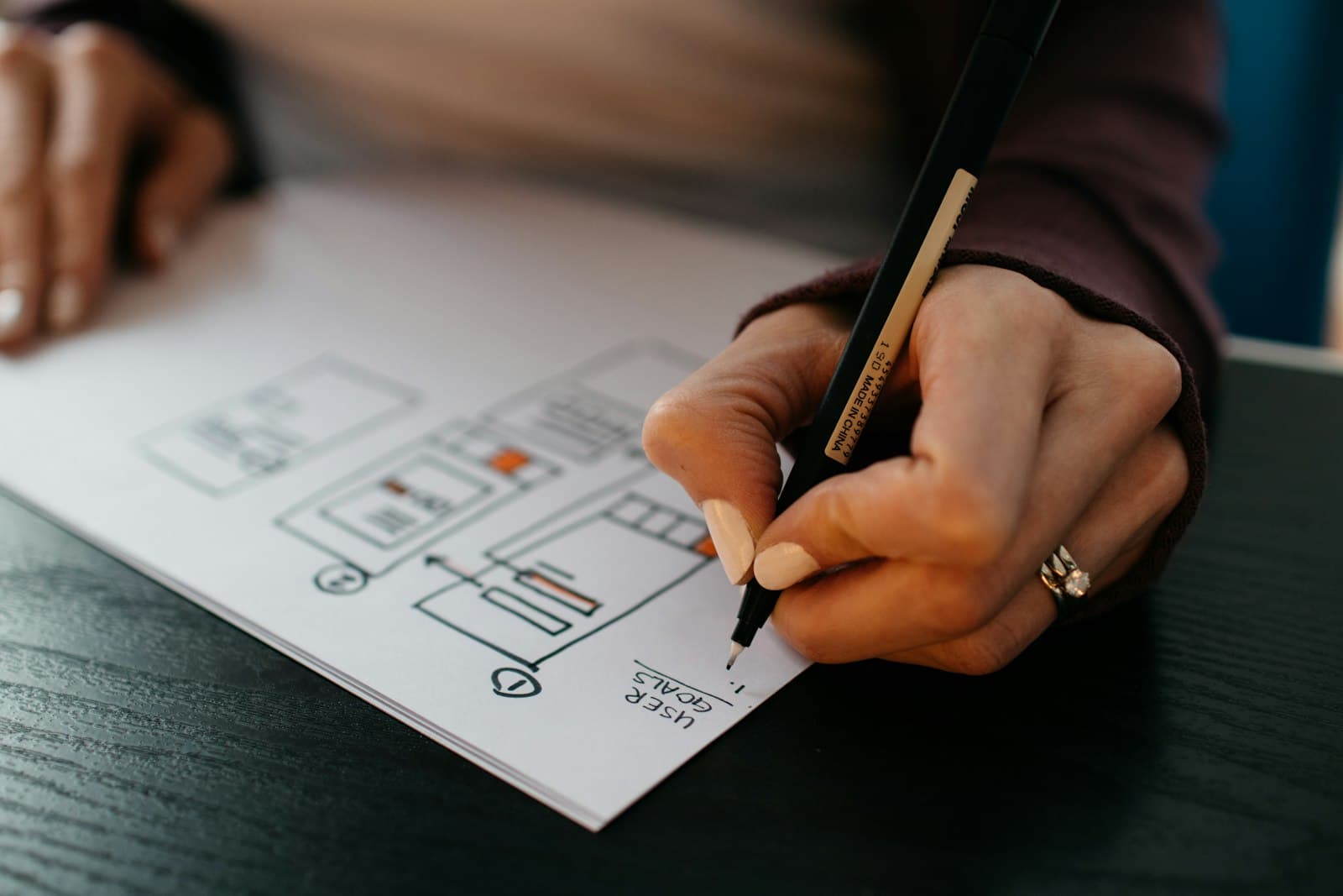
People who already trust you should still recognize the company after a redesign. The website redesign best practices that protect that trust are specific: keep the name, keep the offer, and keep the paths regulars use. Change the structure only where it is failing.
A new visual system can still be the right project. It becomes expensive when it renames the company in the visitor's head, hides the thing you sell, or moves the door regulars already know how to open. Trust is recognition plus follow-through. The redesign has to preserve both.
What regulars are actually using
Before you change layout, write down the paths that already work. Which page do returning customers open? Which link is in the email signature, the invoice, and the Instagram bio? Which product, essay, or contact route do people mention when they write to you?
Those paths are the building. The type and color are the paint. A redesign that moves a well-used contact page, renames a category people search for by memory, or buries a flagship product under a new information architecture will feel like a different company even when the logo is the same.
Ask someone who buys from you, or who has bought, to find the thing they came for last time. Watch the route. If they go straight there, that route stays. If they wander, that route is a candidate for change. The test takes one sitting. It is more reliable than a room full of opinions about a mood.
Keep a list of three paths you will not move without a reason you can say in a sentence. "People open the journal from the homepage" is a reason to keep a path. "We are bored with the grid" is a reason to restyle it, and a weak reason to relocate it.
Keep the name and the offer in the first screen

The name of the company should still be the name. A clever lockup that regulars cannot read at a glance spends recognition you already paid for. Google's guidance on title links asks for descriptive, concise titles, and it warns against vague labels and repeated boilerplate that makes one page impossible to tell from another. On a redesign, that advice is also a trust rule. The homepage title should say who you are. Each inner page should say which page it is, with the brand carried quietly, not pasted as a slogan in front of every title.
The offer belongs in the first screen in words a returning customer still agrees with. If you have narrowed the work, say the narrower offer plainly. If you have kept it, do not make people hunt. Nielsen Norman Group found that people often leave a page in 10 to 20 seconds, and that a clear value proposition has to land within 10 seconds if you want them to stay for minutes. Regulars are faster than strangers, and they are also less patient with a puzzle. They came to confirm they are in the right place.
Put the previous headline and the new headline in the same document. Read both as if you had not sat in the project. The new line can be better. It still has to be true to the same company.
Change the structure where it fails
A redesign earns its scope by naming the failures, then limiting the change to those. A menu that hides the only way to buy is a failure. A homepage that leads with a product you retired is a failure. A phone layout that crops the craft photography into noise is a failure. A color you have simply lived with for three years is not, by itself, a failure.
Thomas Bewick is a useful public example of the distinction. It is an editorial site for a heritage craft brand. The work needed a modern site. The craft, the name, and the feeling of a workshop with a history had to stay legible. A heritage brand does not win trust by looking like a software launch. It wins by being easier to read while the object of the craft remains the point.
Write the failures as sentences before you accept a concept. "Returning readers cannot find the essays." "The shop navigation treats every product as equal, and one product pays the rent." "The phone crops the work until it looks incidental." Each sentence licenses a structural change. Anything outside those sentences needs a separate argument.
This is also how you keep the project from swelling. A studio can design a calmer system, a clearer type hierarchy, and a page that loads as a page. The brief stays honest when every new section has to point at a failure you wrote down. Sections that exist to fill a template are how trust gets diluted. They add surfaces where a regular has to relearn you.
Carry the proof across

Trust lives in particulars. The way you photograph the work, the words you use for the materials, the names of the collections, the about page that tells the truth about who makes the thing. A redesign can improve the sequence. It should not replace those particulars with generic proof, stock scenes, or a voice that could belong to any studio's template.
Read the new pages next to the old ones and mark every proper noun. Names of products, places, processes, and people should survive unless they were wrong. If the new copy could be pasted onto a competitor's site and still make sense, it has sanded off the reason people trusted you.
Google's people-first content guidance asks whether a page demonstrates first-hand experience and whether a reader leaves feeling they learned enough to act. For a company site, that experience is the work you have already done. Show it. Do not swap it for adjectives.
Tell people what moved
When a path does have to move, say so in the place regulars will look. A short note on the old habit works better than a surprise. "The journal now lives here" is enough. Redirects do the technical half. A sentence does the human half.
Do this for the few moves that matter, not for every pixel. A banner that apologizes for an entire new site trains people to expect loss. A quiet pointer on the one relocated door trains them to trust the next visit.
Check the emails, invoices, and social bios that still carry old links. Update the ones you control. Redirect the ones you do not. A beautiful new homepage still fails if the link in last month's receipt opens a dead end.
The same care should continue after launch, when the team has to live with the new structure. The piece on what a redesign handoff has to include is the next decision: the files, the map of the pages, and a place the brand stays findable once the studio steps back.
If you want to see how a heritage site and other public projects hold a point of view while the pages stay clear, the examples are in Hanabi's selected work.
Frequently asked questions
What should stay the same so regulars still trust the company?
Keep the company name readable, the offer in the first screen, and the paths returning people already use. Those paths include the page in your email signature, the product they come back for, and the contact route they remember. Move a path only when you can say, in one sentence, how it is failing.
How should a heritage brand approach a new site?
The craft has to stay legible. Thomas Bewick, a public Hanabi project, is an editorial site for a heritage craft brand that needed a modern page while the work itself remained the point. A heritage company does not need to look like a software launch. It needs to be easier to read without sanding off the particulars people already recognize.
Should we announce that the site has changed?
Announce the few moves that would otherwise feel like a missing door. A short line such as "The journal now lives here," plus a redirect from the old address, is enough. A banner that apologizes for the entire new site trains people to expect loss.
Sources and further reading
- Influencing your title links in search results, Google Search Central
- How Long Do Users Stay on Web Pages?, Nielsen Norman Group
- Creating helpful, reliable, people-first content, Google Search Central
Written by
Hanabi
Hanabi is a product design and web development studio. The studio writes about clear websites, brand systems, and product interfaces for founders.