Signs a website needs a revamp
A website needs a revamp when the offer, the speed, the editing, or the phone layout has failed. Boredom with the current look is a weak reason to start over.
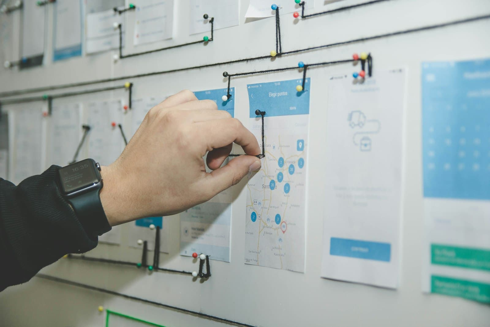
A website needs a revamp when it no longer does the job the company needs it to do. The useful test for when to redesign a website is concrete: a stranger can still tell what you sell, and your own team can still change the page without fear.
Boredom is a weak brief. A founder can be tired of a layout that still explains the offer, loads cleanly, and edits in an afternoon. That site can wait. A revamp starts when the offer has changed, the page is slow in a way people feel, editing has become scary, or the phone was treated as an afterthought.
Boredom is a feeling, and a brief is a job
Teams reach for a redesign when the homepage starts to look familiar to the people who see it every day. Familiar can still be working. The people who already know you are the weakest judges of a first visit. They fill in the gaps from memory, then blame the typeface.
Ask two people who have never heard the pitch to open the site on their phones. Have them say, out loud, what the company does and what they would click next. If both answers match the business you are in now, the visual itch can stay on a list. If they describe a product you stopped selling, or they cannot find a person to talk to, the page has a job problem.
A new typeface will not repair a wrong offer. A new color will not repair a form that nobody owns. Settle the job of the page first. Taste is a later pass, and it is cheaper once the structure is honest.
The offer moved, and the page stayed

The clearest sign is a mismatch between the sentence you say in a sales call and the sentence at the top of the site. You started as a single product. You now sell a service, a second product, or a narrower version of the first idea. The homepage still leads with the old line because changing it means opening a file nobody wants to touch.
Look at the proof as well. Logos, project names, and descriptions that belong to the previous company teach the visitor the previous company. If the work you want next is absent, the site is arguing against the pipeline you are trying to build.
A revamp in this case is a rewrite of structure. The pages, the order, and the one action have to follow the offer you actually want. Write that offer in one sentence and set the homepage headline beside it. If a colleague has to explain the gap, the page is behind the company. The visual layer comes after that comparison is obvious.
The page is slow in a way people feel
Slow is a reason to redo the front of the site when it shows up for real visitors. Google's Core Web Vitals describe three parts of that experience. Largest Contentful Paint should occur within 2.5 seconds of the page starting to load. Interaction to Next Paint should stay under 200 milliseconds. Cumulative Layout Shift should stay under 0.1. Those are the thresholds in Google Search Central's Core Web Vitals guidance.
You do not need a performance hobby to use them. If the main image arrives late, if a tap on the menu waits, or if the page jumps while someone is reading, the visit is already worse. Nielsen Norman Group's research on how long people stay is blunt about the opening. Users often leave in 10 to 20 seconds, and a clear value proposition has to land within 10 seconds if you want several minutes of attention. A page that spends those seconds on a spinner has already spent the decision.
Measure on a phone, on a normal connection, with the images you actually ship. A fast demo on an office laptop can hide a heavy homepage. If the current stack cannot reach those thresholds without heroic exceptions, the sign is real. If a few images and a third-party script are the whole problem, fix those before you commission a new identity. Google's guidance is about real use, so a single desktop lab run is a weak alibi.
Editing the site has become scary

A site the team is afraid to change is already failing, even when it looks fine on a good day. The signs are practical. A headline change requires a developer and a week. The last person who knew the password has left. Drafts cannot be previewed. A seasonal line gets pasted into a chat because the field in the editor is a mystery.
Fear has a cost. The offer drifts in conversation and stays frozen on the site. Campaigns point at a page that cannot name them. Someone eventually pastes a new block into a template, and the layout breaks on one phone.
A revamp is justified when the content model itself is the obstacle. Every page is a one-off, sections cannot be reused, and there is no safe place to edit the words. The reason is weaker when the model is fine and the team has simply never been shown where the headline lives. In that case a short walkthrough beats a new website.
Count the steps for a small change this week. Change a price, a name, or a paragraph, on a copy of the site if you have one. If the path is obvious, you have an editing problem of training. If the path runs through a developer, a plugin, and a prayer, you have a structure problem. Name which one it is before you ask for new visuals.
Mobile was finished last
Open the site at the width you actually use when you send someone the link. Shrunk desktop type, buttons with no priority, and a menu that hides the only path to a conversation all say the same thing. The phone was added after the wide layout was declared done.
This shows up in the work. Columns that made sense on a wide screen collapse into a long stack with three equal actions. A feature table becomes a horizontal scroll. The form asks for the same fields, at a size a thumb cannot hit cleanly. The brand still looks like itself only when the window is large, which is the opposite of how the link gets opened.
A repair can be a layout system rather than a new name. Start from the phone, decide what is cut, what stacks, and what must stay easy to tap. If the desktop page is sound and only the narrow layout is careless, you may keep the identity and still owe the phone a real design. Watch someone hold the phone in one hand and try to reach the primary action. Pinching, overshooting, or rotating the device to cope belongs in the brief.
How to read the signs together
One failed sign can be enough. Two usually mean the project is a change of structure, and a coat of paint will disappoint you. Read them as a list before you hire anyone:
- The offer on the site matches the offer in the room.
- A stranger can say what you do, and how to talk to a person, without help.
- The page meets the Core Web Vitals thresholds Google publishes, on the phones your buyers use.
- Someone on the team can change a headline, a price, or a proof point without a rescue.
- The phone layout was designed on purpose.
If the list fails, the next decision is depth. A revamp keeps a sound content model and the addresses people already use. A rebuild starts when the stack cannot be edited safely, or the offer has changed shape so completely that the old pages would be a costume. That choice is the subject of the piece on whether to revamp the front end or rebuild.
When the signs are real and you want the next version designed and built as one piece of work, look through Hanabi's services for marketing sites, product interfaces, and the smaller rebuilds a founder actually needs.
Frequently asked questions
How do I tell boredom from a real reason to redesign?
Boredom is being tired of a layout that still explains the current offer, loads well, and can be edited. A real reason is observable. The offer on the page is stale, the page is slow for visitors, the team is afraid to change a sentence, or the phone layout was squeezed in after the desktop was finished. If strangers can still say what you sell, the visual itch can wait.
Does a slow homepage mean the whole site should be replaced?
A slow homepage means you should measure it before you commission a new identity. Google's Core Web Vitals guidance asks for largest contentful paint within 2.5 seconds, interaction to next paint under 200 milliseconds, and cumulative layout shift under 0.1. If a heavy image or a third-party script is the cause, fix that first. If the stack cannot reach those thresholds, the slowness belongs in the brief.
Can the brand stay while the site is revamped?
Yes, when the identity still matches the company and the failure is structural. Keep the name, the voice, and the proof while you change the page order, the phone layout, or the way the site is edited. A new coat of color, on its own, is a smaller project than a revamp.
Sources and further reading
- Understanding Core Web Vitals and Google search results, Google Search Central
- How Long Do Users Stay on Web Pages?, Nielsen Norman Group
Written by
Hanabi
Hanabi is a product design and web development studio. The studio writes about clear websites, brand systems, and product interfaces for founders.